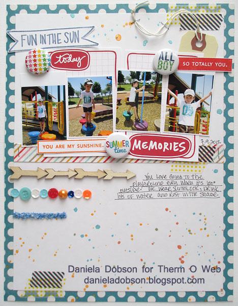
 Fun in the sun layout by Daniela Dobson
Therm O Web Supplies:
Therm O Web Sticky Strip Runner
Therm O Web Zips TM Ultra Thin
Therm O Web Zots™ Medium
Other Supplies:
Cardstock
Basic Grey and My Mind’s Eye Patterned paper
Technique Tuesday Story Cards and stamps
Heidi Swapp Color Shine
Studio Calico arrows
Flower Soft
Sequins
Buttons
{A Flair For Buttons} Flair
Clearsnap ink
Decorative tape
Avery tag
Directions:
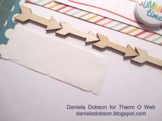
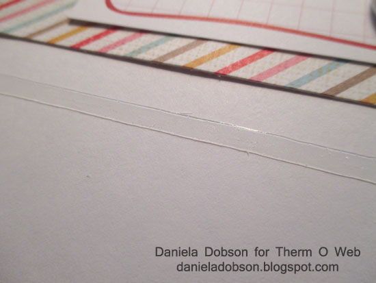
1. Zips are clear adhesive lines. They are ultra thin and about 1/8″ wide. These thin lines of glue are perfect for paper strips, ribbon, paper borders and other long embellishments, or in this case repeated embellishments. Cut the Zips to the desired length. Apply to cardstock and peal top layer. First, adhere the arrow wood veneers.
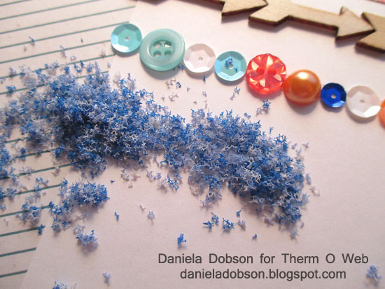
 2. For the second row adhere various sequins, buttons and jewels. For the last row, adhere flower soft.
 3. For the layout, adhere photos over story cards. Stamp sentiments on cardstock, cut out and adhere. Add flair buttons, avery tag, decorative tape and sprinkle with color shine. Use Therm O Web Sticky Strip Runner to adhere all the paper and Therm O Web Zots™ Medium for the flair.
Thank you for stopping by and I hope you give ZipsTM a try. Have a great day.
We’re celebrating Christmas in July with a glittery sale on all of our Glitter Dust™ products!
Save 20% off on our Glitter Dust™ Sprays and NEW Glitter Dust™ Photo Corners. They’re the perfect complement to your holidays cards so get a jump start!


Jean Bullock
July 22, 2013 at 12:03 pm (12 years ago)The Zip looks great and would be very useful to hold heavier items. The scrapbook page is very cute.
I do have one suggestion. I would love it if you could have a standard font for the comment box. The same one that you use on the blog would be fine. The one in current use is very small and difficult to read.
Thanks.